BMTF News
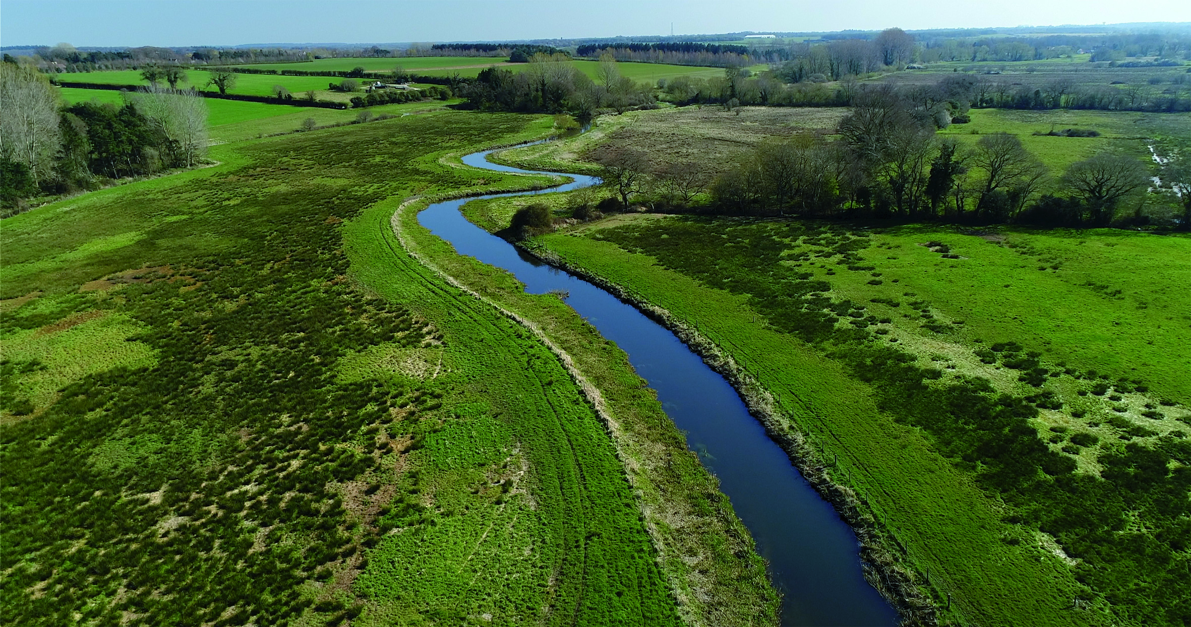
Goff’s off to a good start
A bumper month at Goff’s
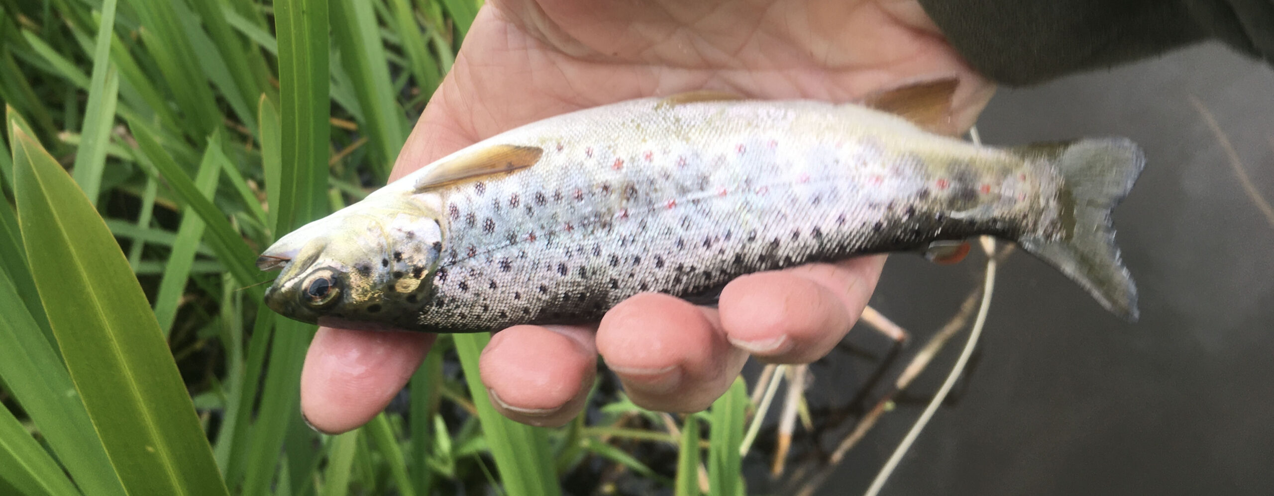
Day tickets have been available on the Goff’s beat from April, and in only two months the scheme has proved a great success, with some anglers reporting catches of up to 13 fish in one session. The beat has been stocked, but the new influx of anglers has also revealed a significant wild trout population, with fish of all sizes being caught.
The season got off to an indifferent start, with cold, windy weather inhibiting activity, but May has proved to be a bumper month, with an average of 2.65 fish per angler visit, a record for the Bintry Mill Trout Fishery.